JavaFX v1.3 includes a brand new and much more powerful CSS-based styling and skinning engine. This article will take a peak under the covers and show you how to get the most out of JavaFX styling so you can develop a unique look for your applications. I'll even show you how to do some basic re-skinning of the core controls - changing not just their color scheme but also their shape! - all from the comfort and convenience of your style sheet. That is a lot of ground to cover so we better get started.
Understanding Regions
Warning!!
The Region API is not public and is not considered a finished work. It can, and certainly will, change in future versions. Maybe even in JavaFX v1.3.1. The code presented here is for demonstration of the concepts underlying the new styling system in JavaFX 1.3. If you are considering using this information to build your own custom controls, be sure you understand the down side of using private APIs!
In v1.3 the core controls are made up of regions. Regions are basically a shape with one or more backgrounds and borders. All core control skins inherit from SkinBase which extends Region. Take the LabelSkin as an example. Its inheritance hierarchy looks like this:
LabelSkin -> SkinBase -> Region -> Stack
So the controls are regions, but they can also have zero or more sub-regions. Think of a scroll bar control. It is a region, but it also has sub-regions for the thumb button, the track, and the up and down arrow buttons.
Regions are tied into the new CSS system and can be fully specified, right down to their shape, from a style sheet.
Note that SkinBase does not inherit from Skin at any point. A SkinBase can be assigned to a custom control's skin variable through the use of the SkinAdapter class. The SkinAdapter will take care of passing along the control and behavior assignments to the SkinBase when SkinAdapter is set as the Control's skin.
Creating a Demonstration Control
I simply define a class that extends Control, assign the skin using the SkinAdapter, and override the styleClass variable.
public class DemoControl extends Control {
    // This is the class I'll use in style sheets
    override var styleClass = "demo-control";

    // SkinAdapter lets me use a Region as a Skin
    override var skin = SkinAdapter {
        rootRegion: DemoControlRegionSkin{}
    }
}
Next I define a Region-based skin by creating a class that extends SkinBase.
public class DemoControlRegionSkin extends SkinBase {
    // SkinAdapter will set up SkinBase's control and behavior vars
    var cc = bind control as DemoControl;

    // You should always give your control skins a default preferred size
    override function getPrefWidth( height ) { 100 }
    override function getPrefHeight( width ) { 100 }
}
JavaFX Styling Techniques
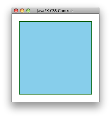
I think it's best to start with a basic example and build up from there. So I'll begin by creating a simple scene and adding our new demo control.
Stage {
    title: "JavaFX CSS Controls"
    scene: Scene {
        var stack:Stack;

        width: 300
        height: 300
        stylesheets: "{__DIR__}controlStyles.css"

        content: [
            stack = Stack {
                width: bind stack.scene.width
                height: bind stack.scene.height
                content: [
                      DemoControl {
                          layoutInfo: LayoutInfo {
                              width: 250
                              height: 250
                          }
                      }
                ]
            }
        ]
    }
}
I created a simple Scene that is 300 by 300 pixels and has a Stack container that fills it completely. I then created a new instance of my DemoControl and set it's preferred width and height to be 250 pixels. Note that this will override the preferred width and height of 100 that I entered into the control skin itself when I added those functions. By default a Stack will size its children to their preferred size and center them. Therefore, when this program is run we should see a 250 by 250 rectangle (a.k.a. a square) centered in the scene. I'll now add some minimal styling in controlStyles.css (which is added to the Scene above) so the Region's rectangle will be visible.
.scene {
    -fx-font: 16pt "Amble";
    -dean-slightlydarkergreen: derive( green, -25% );
}

.demo-control {
    -fx-background-color: skyblue;
    -fx-border-color: -dean-slightlydarkergreen;
    -fx-border-width: 2;
}
This small style sheet first sets a default font for the Scene. I haven't added any controls with text yet, but I will later and it's always nice to set these things up in one place. Below the font attribute, I demonstrate a feature of JavaFX styling: the ability to derive a new color from an existing one and store it for later use. In this case, I created a darker version of Green and named it -dean-slightlydarkergreen. Not only am I now immortalized in my own style sheet, but the DemoControl can reference this attribute later as shown above for the control's border color. Note that I use the same class string "demo-control" that I hard-coded into my DemoControl class. Let's see how this looks so far.
Gradients
You can also specify linear gradients in your style sheet. The image and code below shows a fancier version of the DemoControl.
 |
#gradient.demo-control {
    -dean-lightnavy: derive(navy, 100%);
    -dean-navygrad: linear (0%,0%) to (100%,0%) stops (0%, -dean-lightnavy) (100%, navy);
    -fx-background-color: linear (0%,0%) to (0%,50%) stops (0%, derive(deepskyblue, 80%)) (30%, deepskyblue) reflect;
    -fx-border-color: -dean-navygrad null -dean-navygrad null;
    -fx-border-width: 8 0 8 0;
} |
You can see by the CSS selector "#gradient.demo-control" that this style will be applied to DemoControls with "gradient" for an ID. I didn't have to change any JavaFX script code to make this work other than adding the id: "gradient" attribute to the DemoControl's object literal declaration in the Scene, thereby picking up this new style.
In this style, I also derive a new light navy color and then reference it again when I define my navy gradient (-dean-navygrad). This gradient is then used as the border color. I use it on the top and bottom while setting the left and right border colors to null. Similarly, I set the top and bottom border widths to 8 pixels while the left and right borders have a 0 width. Many style attributes of a Region have this ability to specify top, right, bottom, and left properties individually. On the other hand, if I were to simply say "-fx-border-width: 8" then all borders would be 8 pixels wide.
The Region's background color is a slightly more complicated linear gradient. It goes half way down the rectangle and is then reflected so the bottom half matches the top. Note that you can even embed "derive" functions inside of linear gradient definitions. More power!
Multiple Backgrounds
As I said at the beginning, Regions are made up of a shape and one or more backgrounds and borders. Let's take a look at how you define multiple backgrounds and borders for your region. Once again, I will make no changes to our source code other than the control's ID in the scene and a new style in the style sheet.
 |
#multibg.demo-control {
    -fx-background-color: skyblue, mediumaquamarine;
    -fx-background-radius: 15 0 15 0;
    -fx-background-insets: 0, 20;
    -fx-border-color: navy, darkcyan;
    -fx-border-style: dotted;
    -fx-border-width: 2;
    -fx-border-radius: 15 0 15 0;
    -fx-border-insets: 0, 20;
} |
Most of the style attributes of a Region can take multiple items in their declarations. You can see examples of this in the declarations of the -fx-background-color, -fx-background-insets, and the -fx-border-color attributes. In these cases, the first item is applied to the first background, the second item is applied to the second background and so on. Therefore we end up with a skyblue rectangle with navy border and a medium aquamarine rectangle with a dark cyan border. The first background has no insets (it is filled right to the border of the control), while the second rectangle is inset by 20 pixels on all sides.
In cases where there are multiple backgrounds but only one item specified, the first item will be applied to all backgrounds. For example, both rectangles have top-left and bottom-right rounded corners defined by the -fx-background-radius and -fx-border-radius attributes. Since only one set of radius attributes are defined, it will be applied to both backgrounds.
The thing to remember is that commas separate multiple items in a single attribute (as in the two items specified by -fx-background-color above), whereas spaces are used as the separators in an item that can take multiple values (as in the one item having 4 values specified by -fx-border-radius above). Crystal clear? Good. Let's take it up a notch.
Getting Fancier
Here's a twist: many of those attributes that can take multiple values in a single item (like -fx-border-radius) can also take multiple items. This allows you, for example, to specify a different set of border radius values for each background.
 |
#multibgoppcorners.demo-control {
    -fx-background-color: skyblue, mediumaquamarine;
    -fx-background-radius: 15 0 15 0, 0 15 0 15;
    -fx-background-insets: 0, 20 40 20 40;
    -fx-border-color: navy, darkcyan;
    -fx-border-style: dotted, dashed;
    -fx-border-width: 2, 1;
    -fx-border-radius: 15 0 15 0, 0 15 0 15;
    -fx-border-insets: 0, 20 40 20 40;
} |
Here I specify a completely different set of values for the -fx-background-radius, -fx-background-insets, -fx-border-radius, and -fx-border-insets attributes for each background. Remember, multiple values within a single item are separated by spaces while multiple items are separated by commas.
Styling Conclusions
In this section I've experimented with the most common style attributes that are used on Regions. You can also use the regular Node style attributes that I covered here. Of interest will be Node's -fx-opacity, -fx-effect, and -fx-cursor attributes. It should also be noted that Regions have a corresponding set of attributes for image-based backgrounds and borders (i.e. -fx-background-image and -fx-border-image and so on). I'm not going to cover them here, but I would expect Oracle to publish full documentation on these attributes very soon.
Shaping Controls
So far, I've just used the default rectangular shape but by using the style sheet I can make a region take on just about any shape that can be imagined. The shape of a Region is specified using SVG path notation. This notation uses a compact encoding to describe shapes using a series of commands and coordinates. Commands are represented by a single letter. For example, M is the move-to command. If the command letter is upper case then the coordinates that follow are considered absolute coordinates whereas the coordinates are interpreted as relative if the letter is lower case. So "M 0 1" means move to location 0,1 while "m 0 1" means move 1 unit in the y direction from the current location. See this page for details of the SVG path syntax.
Movement and Lines
Drawing shapes with one or more lines is extremely easy. The format of the commands is shown in the following table.
| Move to | M x y
m x y |
| Line to | L (x y)+
l (x y)+ |
| Horizontal line to | H x |
| Vertical line to | V y |
| Close the current path | Z
z |
Suppose I wanted a triangular region instead of the default rectangle.
 |
#line.demo-control {
    -fx-shape: "M 0,1 L 1,1 .5,0 Z";
    -fx-background-color: skyblue, blue;
    -fx-background-insets: 0, 20 20 10 20;
}
|
The coordinate system used in these paths is the same one used in JavaFX: x increases to the right, y increases down. So our shape is defined as:
- Move down one unit in the y direction
- Draw a poly-line to the coordinate 1,1 and then 0.5,0
- Close the path
By the way, the use of commas to separate the x,y coordinates in a SVG path command are purely optional. I like to use them because it makes the command more readable to me. I'm using capital letters so those coordinates are absolute, not relative to each other. By default, the shape is scaled to fill the area of the control, so the scale of the coordinates doesn't matter. I could have just as easily used 0, 50, and 100 rather than 0, 0.5 and 1.0.
You can see that even though the shape has changed, our ability to specify multiple backgrounds with offsets hasn't. One thing to watch our for is that, with non-rectangular shapes, the insets may need to be adjusted to keep the inner shape centered. Here I had to adjust the bottom inset of the second background to make the triangles look centered. I don't know if this is a bug or a feature, but for JavaFX 1.3 be aware that you may need to play with the insets to get things to look exactly as you want. And although the coordinates of the shape are scaled, the insets are still specified in pixels.
Cubic Curves
The SVG path commands for drawing cubic Bezier curves are shown in the following table.
| Cubic Bezier curve to
Draws a curve from the current point to x,y.
x1,y1 is the control point at the beginning of the curve.
x2,y2 is the control point at the end of the curve. | C (x1 y1 x2 y2 x y)+
c (x1 y1 x2 y2 x y)+ |
| Cubic Bezier curve to (shorthand)
Draws a curve from the current point to x,y.
The control point at the beginning of the curve is the reflection of the second control point from the previous curve.
x2,y2 is the control point at the end of the curve. | S (x2 y2 x y)+
s (x2 y2 x y)+ |
So let's take a look at a region shaped with cubic curves.
 |
#cubic.demo-control {
    -fx-shape: "M100,200 C100,100 250,100 250,200 S400,300 400,200 Z";
    -fx-background-color: skyblue, blue;
    -fx-background-insets: 0, 10;
} |
This is admittedly a somewhat fanciful shape for a control. It is important to note that the control's clickable area still takes up the whole 250 by 250 pixels even though the Region's backgrounds take up a smaller area.
Quadratic Curves
The quadratic Bezier curve commands are shown in the table below.
| Quadratic Bezier curve to
Draws a curve from the current point to x,y.
x1,y1 is the control point of the curve. | Q (x1 y1 x y)+
q (x1 y1 x y)+ |
| Quadratic Bezier curve to (shorthand)
Draws a curve from the current point to x,y.
The control point at the beginning of the curve is the reflection of the control point from the previous curve. | T (x y)+
t (x y)+ |
Let's take a look at a quadratic curve example.
 |
#quadratic.demo-control {
    -fx-shape: "M0,200 Q100,50 200,200 T500,100";
    -fx-background-color: skyblue, blue;
    -fx-background-insets: 0, 10;
} |
The shape of our region just keeps getting more interesting!
Elliptical Arcs
The arc command is easily the most confusing of the SVG path commands. Use of SVG graphical editors is highly recommended!
| Elliptical arc to
rx ry - The radius of the resulting arc
x-axis-rotation - Rotation of the x in degrees
large-arc-flag - If 1 then the largest arc between the start and end points will be drawn. If 0 then the smallest are will be drawn.
sweep-flag - Indicates the direction in which the arc is drawn. A 1 specifies the positive direction, a 0 specifies the negative direction.
x y - The end point of the resulting arc. These are absolute coordinates or are relative to the start point (the current location) depending on whether the A or a command is used. | A (rx,ry x-axis-rotation large-arc-flag sweep-flag x,y)+
a (rx,ry x-axis-rotation large-arc-flag sweep-flag x,y)+
|
What are arcs good for? Lot's of things, of course, but circles are an obvious choice. However, drawing a circle with arc commands is not as trivial as you would imagine. Here is an example.
 |
#arc.demo-control {
    -fx-shape: "M 50,30  m 0,25  a 1,1 0 0,0 0,-50  a 1,1 0 1,0 0,50";
    -fx-background-color: skyblue, blue;
    -fx-background-insets: 0, 10;
}
|
As you can see, you actually need to define two arcs: one for each 180 degree ellipse.
Final Thoughts on Shapes
The ability to change, not just the colors, but the actual shapes of the regions that make up the core controls gives application developers unprecedented control over the look of their applications. Need a slider with a gold star for the thumb track? Easy. Buttons that look like clouds? Very do-able. The only limit is your imagination. Just remember, as with many of the things that JavaFX makes easy for developers: with great power comes great responsibility!
Using Caspian Styles
One last thing I want to address is the subject of using that styles in caspian.css with your own controls. The Caspian class in JavaFX 1.2 contained several nice utility functions that would generate nice gradients that tied into the Caspian theme. That class no longer exists in JavaFX 1.3. To use the Caspian theme with your own controls, you will need to use the values defined in the caspian.css style sheet.
Let's return to the DemoControl and make it look like it fits in with the Caspian controls.

|
#caspian.demo-control {
    -fx-background-color: -fx-body-color;
    -fx-background-radius: 5;
    -fx-border-color: null;
} |
As you can see, all I've done is use the -fx-body-color attribute from caspian.css as my background color, added a corner radius to match Caspian's, and turned off the border I would normally inherit from the default demo-control style. In order for the -fx-body-color attribute to be defined, the caspian.css has to be loaded into the scene. Instantiating any core control will take care of this. In this case, I not only instantiated a button, but I also added it to the scene's Stack container just for comparison.
Adding Borders
Now I'll go the whole nine yards and add Caspian-style borders as well. I can take these right out of the button style in caspian.css.
#caspianborders.demo-control {
    -fx-background-color: -fx-shadow-highlight-color, -fx-outer-border, -fx-inner-border, -fx-body-color;
    -fx-background-radius: 5, 5, 4, 3;
    -fx-background-insets: 0 0 -1 0, 0, 1, 2;
    -fx-border-width: 0;
}
Here I have actually defined four different backgrounds for the DemoControl's region. The insets are used to make sure they appear properly as a shadow, two borders and the body. Using the Caspian-defined attributes for body, border and shadow color means that my DemoControl will respond to changes in the application-defined -fx-base attribute. This is the attribute you would set if you wanted to change the base color of all Caspian controls in the entire application. I can set -fx-base to a new color in the .scene style and both DemoControl and the button will pick up the change.

|
.scene {
     -fx-font: 16pt "Amble";
     -fx-base: dodgerblue;
} |
Final Conclusion
I really like the power and flexibility of the new CSS support in JavaFX 1.3. Styling and skinning controls is now easier than ever. If you need to, you can create an entirely unique look for your application without having to change any lines of JavaFX source code. It brings us a true separation of presentation and program logic. All in all, I give it a gold star. A gold star button even!

|
#star.button {
     -fx-shape: "M 50,5 L 37,40 5,40 30,60 20,95 50,75 80,95 70,60 95,40 63,40 Z";
     -fx-base: goldenrod
} |
References
I found these things handy while learning about all of this:
- The caspian.css style sheet located in com/sun/javafx/scene/control/skin/caspian/caspian.css in the javafx-ui-controls.jar packaged with the JavaFX SDK.
- The Style Editor example at: http://www.javafx.com/samples/StyleEditor/index.html


